# Add components to the Checkout page
Use the following procedure to integrate the Digital River components into the Checkout page using the Layout Accordion component. Some Digital River components may be added to other pages outside the Checkout page. You can also find the steps for that in the section.
{% hint style="info" %}
**Prerequisite**: Before starting these steps, ensure you use the B2B Commerce (LWR) storefront template and that your Checkout page is configured with the **Checkout Layout: Accordion** component.
{% endhint %}
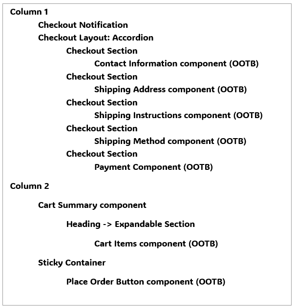
First, go to the Experience Builder and select the Checkout page from the page menu. The default page structure will look like this:
Once completed with configuring the components on the page, the structure will be similar to the following:
{% hint style="info" %}
**Note**: You can be flexible in arranging components and also use custom versions of components. The structure below is suggested as a starting point before making customizations.
{% endhint %}
**Footnotes:**\
1 You may use the provided `drb2b_BuyerInfo_LWR` component with the OOTB look and feel. Optionally, you may implement a custom component to achieve a custom look and feel when collecting buyer information. See information about [customizing the Buyer Info component](https://docs.digitalriver.com/salesforce-lightning/salesforce-lightning-b2b-commerce-app-2.1/extend-the-salesforce-lightning-app/customizing-the-lightning-web-components/components/buyer-info-component) for considerations. \
2 The `drb2b_OrderSummary_LWR` component must be on the page for order place logic to work correctly. However, we recommend that the component be added with all display options disabled. The instructions in this section will detail the recommended Designer Attributes.\
3 We suggest removing the OOTB Cart Summary component and instead use `drb2b_checkSummary_LWR`, which provides additional details related to duties and fees and is responsive to changes made to the Digital River checkout. \
4 The `drb2b_DRUtil_LWR` component does not have a UI and is hidden on the page. It can be placed anywhere on the page but is required for the checkout to function properly.
Continue with the following steps:
1. Drag and drop each component onto the Checkout page, following the above page structure. For each component, set the Designer Attributes as indicated in the following steps.
2. If you use the`drb2b_BuyerInfo_LWR` component, remove the Contact Information and Shipping Address OOTB components. The Shipping Instructions component is optional. Set the following designer attributes for the `drb2b_BuyerInfo_LWR` component:
* Show Shipping Address: Checked (default). If you plan to sell only digital products, you may change this to false (unchecked) so that the Shipping Address is not shown to the shopper.
3. Remove the OOTB payment component (Dual Payment) from the Checkout Section containing the OOTB payment component (Dual Payment)t.
4. Drag and drop the `drb2b_taxIdentifer_LWR` component to the Payment Checkout Section. Set the following designer attributes for the drb2b\_taxIdentifer\_LWR component
* Selected Tax Identifier: leave blank
* Auto Initialize: Checked (default)
5. Drag and drop the `drb2b_Payments_LWR` component to the Payment Checkout Section. The `drb2b_Payments_LWR` component does not have any designer attributes. Drag and drop it onto the screen
6. Drag and drop a new Checkout Section component onto the screen. This section should be the last section nested within the Checkout Layout: Accordion component. It should be the same level as the other Checkout Section component.
* Within the new Checkout Section, Edit the Text Block with the desired title for the section. For example, “Terms and Place Order.”
* Remove the action button from this section (this is a "Proceed" button by default). It will not be used.
7. Add the `drb2b_DrTermsElement_LWR` component to the new custom section “Terms and Place Order.” Set the following designer attributes for the drb2b\_DrTermsElement\_LWR component:
* Heading: leave blank
* Bypass Validation: Unchecked (default)
* Hide Terms UI: Unchecked (default)
* Auto Initialize: Checked (default)
8. Add the `drb2b_orderSummary_LWR` component to the new custom section “Terms and Place Order.” Set the following designer attributes for the drb2b\_orderSummary\_LWR component:
* Show Duty: Unchecked
* Show Shipping: Unchecked
* Show Regulatory Fee: Unchecked
* Show Tax: Unchecked
* Show IOR tax: Unchecked
* Show All: Unchecked
* Show Grand total: Unchecked
* Show Subtotal: Unchecked
* Auto Initialize: Unchecked
* Show Promotion: Unchecked
* Show Place Order: Unchecked
* Bypass Validation: Unchecked
* Place Order: Checked
9. Add the `drb2b_placeOrder` component to the new custom section “Terms and Place Order.” Set the following designer attributes for the `drb2b_placeOrder` component:
* Display PlaceOrder Button: Unchecked
10. Add the drb2b\_drCompliance\_LWR component to the footer or anywhere on the page as desired. This component must be visible to the shopper at all times, so it should not be nested inside the Checkout Layout: Accordion component. Set the following designer attributes for the `drb2b_drCompliance_LWR` component:
* Use Default Selling Entity: Unchecked\
**Note:** This value should be Checked on all pages outside of Checkout. On the Checkout page, it should remain Unchecked.
11. In Column 2, remove the OOTB Cart Summary component.
12. In Column 2, drag and drop the OOTB Cart Items component inside the Sticky Container.
* Shoppers should not be allowed to modify the cart once checkout has started. Set the following designer attributes as follows to prevent shoppers from modifying the cart:
* Show remove item option: Unchecked.
* Quantity Selector > Hide quantity selector: Checked
13. In Column 2, drag and drop the `drb2b_checkoutSummary_LWR component`. Set the following designer attributes for the `drb2b_checkoutSummary_LWR` component:
* Show Duty: Checked
* Show Shipping: Checked
* Show Regulatory Fee: Checked
* Show Tax: Checked
* Show IOR tax: Checked
* Show Grand total: Checked
* Show Sub total: Unchecked
* Show All: Checked
* Show Amount Contributed: Unchecked
* Show Remaining Amount: Unchecked
* Show Promotion: Checked
14. In Column 2, drag and drop the `drb2b_addressDetails_LWR` component. Set the following designer attributes for the `drb2b_addressDetails_LWR` component:
* Show Shipping Address: Checked (default). If you plan to sell only digital products, you may change this to false (unchecked) so that the Shipping Address is not shown to the shopper.
* Show Billing Address: Checked (default)
15. Drag and drop the `drb2b_DRUtil_LWR` component to Column 2 or anywhere on the page. This component does not have a UI but is required for the checkout to function properly. This component does not have any designer attributes.
16. Once you have completed all changes, publish the site. After publishing is complete, changes can be tested on the live site.